A number of eChalk site managers have seen Drew Charter’s eChalk site (http://www.drewcharterschool.org/) and asked us: how did Drew do that? It is a beautiful and well organized site. We thought we’d take a look under the hood and share five tricks Drew has employed to make their site truly outstanding. You might want to borrow one or two of these techniques for your site!
1. Header image treatment

Drew has a header image of its modern main building, highlighting the charter school’s excellent facilities. The image provides texture – it is meant to convey an idea about the school, but not draw too much attention to itself. Drew used only one image—there is no slide show—and the lack of motion also allows the image to recede. This is an excellent use of the “News” theme, where the header image is meant to serve as background, unlike the Reprise and Brochure themes, which are meant to catch the viewer’s attention with large, detailed images.
How to achieve: Avoid images that emphasize a subject and that have a large depth of field. Images that can serve as textures work the best in this header. The muting effect on the Drew header image is automatically added by the News Theme. For sizing/aspect ratio: the image will be nearly square on a mobile phone, but will be wide and short on a computer screen; test your image to make sure it works in both situations.
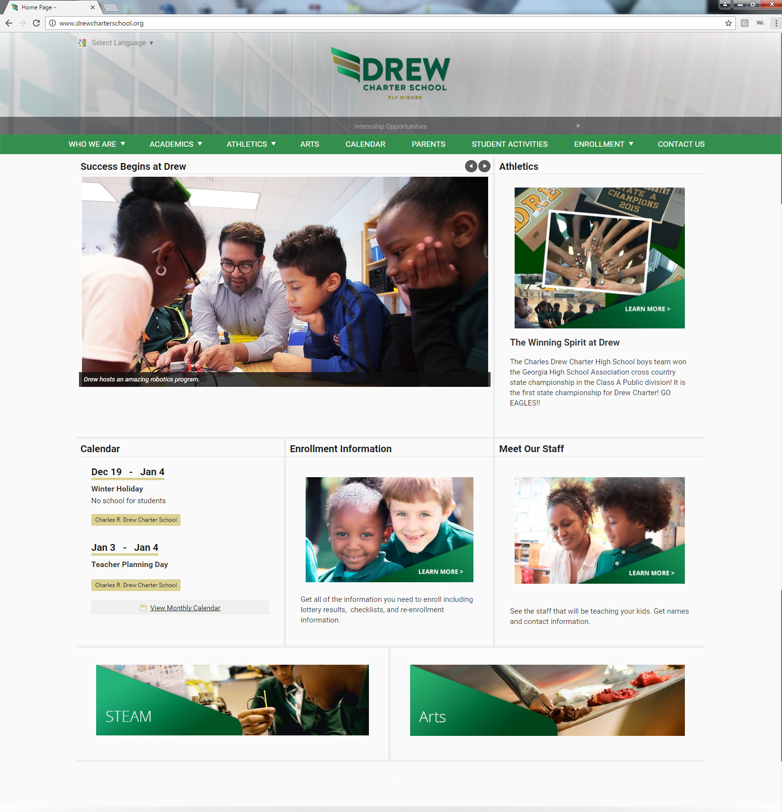
2. Homepage topic images
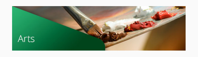
On the homepage, Drew has placed five clickable images leading to key topics (Athletics, Enrollment, Meet the Staff, STEAM, and Arts). These images have a common treatment, with a green “Learn More” triangle in the corner of the image. This technique creates a consistent and professional look and guides a visitor to the topics Drew wants to emphasize.
How to achieve: Use a text block to create each topic area on your home page. Use “insert image” to place the image in the top left hand corner of the text box (use Photoshop or similar to superimpose a “Learn More” graphic on each topic image). Click once on the image to highlight it, and click the hyperlink icon in the toolbar. Add the link URL and click “OK.” Type any text (e.g. “See the staff that will be teaching your kids. Get names and contact information.”) below the image.
3. Sub-section headers
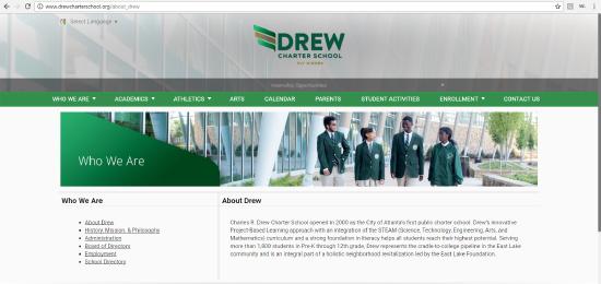
On Drew’s site, every page reachable from the main navigation has a section image and title at the top (e.g. all of the pages in “Who We Are” share have an image of four students with the “Who We Are” section title superimposed). This allows a visitor always to know where they are in the site. An additional enhancement would be to make this image clickable, taking you back to the section home page.
How to achieve: Choose an image that’s appropriate as a header for this section. The image should be sized to fit a wide, short row (for the News Theme, the optimal size for an image in the 100% row is 1270x265 – for optimal sizes in other themes, go to http://help.echalk.com and search for “optimal image sizes”). Superimpose a section title graphic (“e.g. “Academics”) on the image using Photoshop or similar. Create a text block in a 100% wide row, tall, at the top of each section page and insert the image in the text block.
4. Sub-section layout and navigation
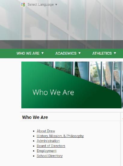
Every subsection on Drew’s site has a left-hand navigation that repeats the main navigation for the site. This further orients the site visitor and allows them to easily move from one sub-section page to another. The subsections also all have sub-section title and content in a wide right-had column. The consistent layout makes finding information a breeze.
How to achieve: On each sub-section page, start with a 33%/66% row, tall. The 33% block is a text block, where title is the overall section title (e.g. “Who We Are”). The 33% block content is a bullet-point list of links to all sub-sections. The 66% block is also text, and title is the sub-section title (e.g. “History, Mission, and Philosophy”). The 66% block content is specific to that sub-section.
5. Parent page
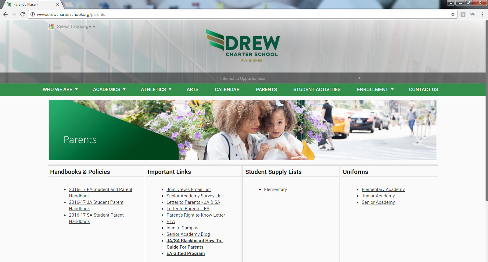
Drew has one page entirely dedicated to providing parents with the resources and information they need. It is laid out in four clear sections: Handbooks and Policies, Important Links, Student Supply Lists, and Uniforms. This is a great way to give parents everything they need, all in one place while avoiding an unmanageably long list in your main navigation.
How to achieve: This one is easy! Just create a page with a 100% row (for the Sub-section header – see steps above) and, below that, a 25%/25%/25%/25% row. Each of the 25% blocks should be a text block. Each text block should have a title (e.g. “Uniforms”) and a bullet point list of links.